Creating a sub-brand for an
in-house D&I initivive.
Kin + Carta’s Inclusion, Diversity, Equity, and Awareness program (IDEA) embodies their commitment to fostering an environment where every individual, irrespective of gender, ethnicity, religion, or background, feels safe, empowered, and included.
Kin + Carta wanted to stand out from the competition with their diversity proposition and so instructed me to create Something instantly recognisable as an IDEA initiative and that would form a part of their culture.
Logo
I took the plus icon from the main Kin + Carta logo, broke off a quadrant of it, rotated it 90 degrees to create a heart shape. I then duplicated this 4 times to represent the 4 pillars of IDEA and then chose a graident colour scheme which represented each sister agency within Kin + Carta at the time (Connect, Create, Advise)

The Concept
Just a small look at some of the development work that went into the project and that was presented back to the board.
Digital & Print Applications
How the brand was use to create impactful designs across digital and print assets.


Other Applications
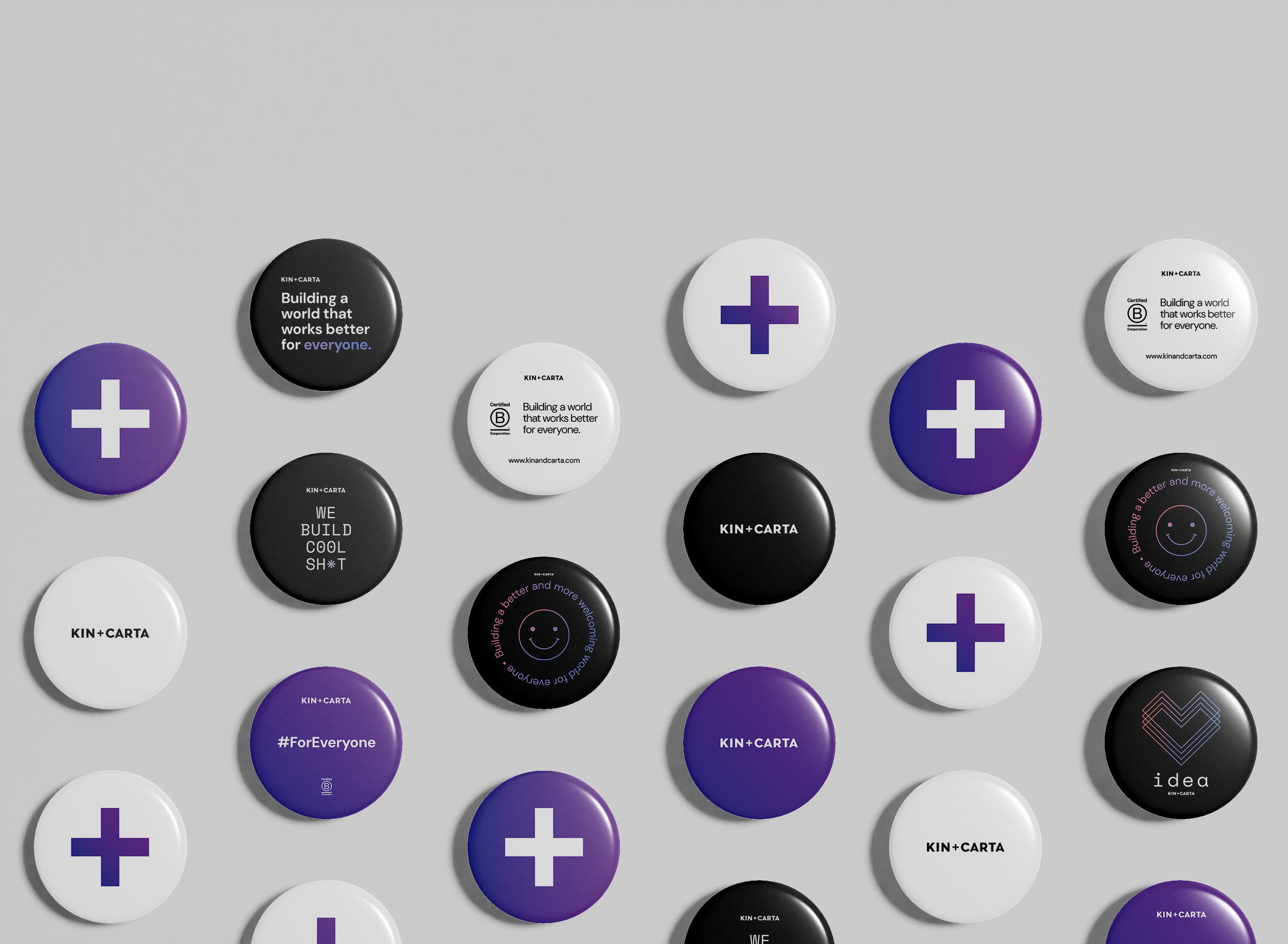
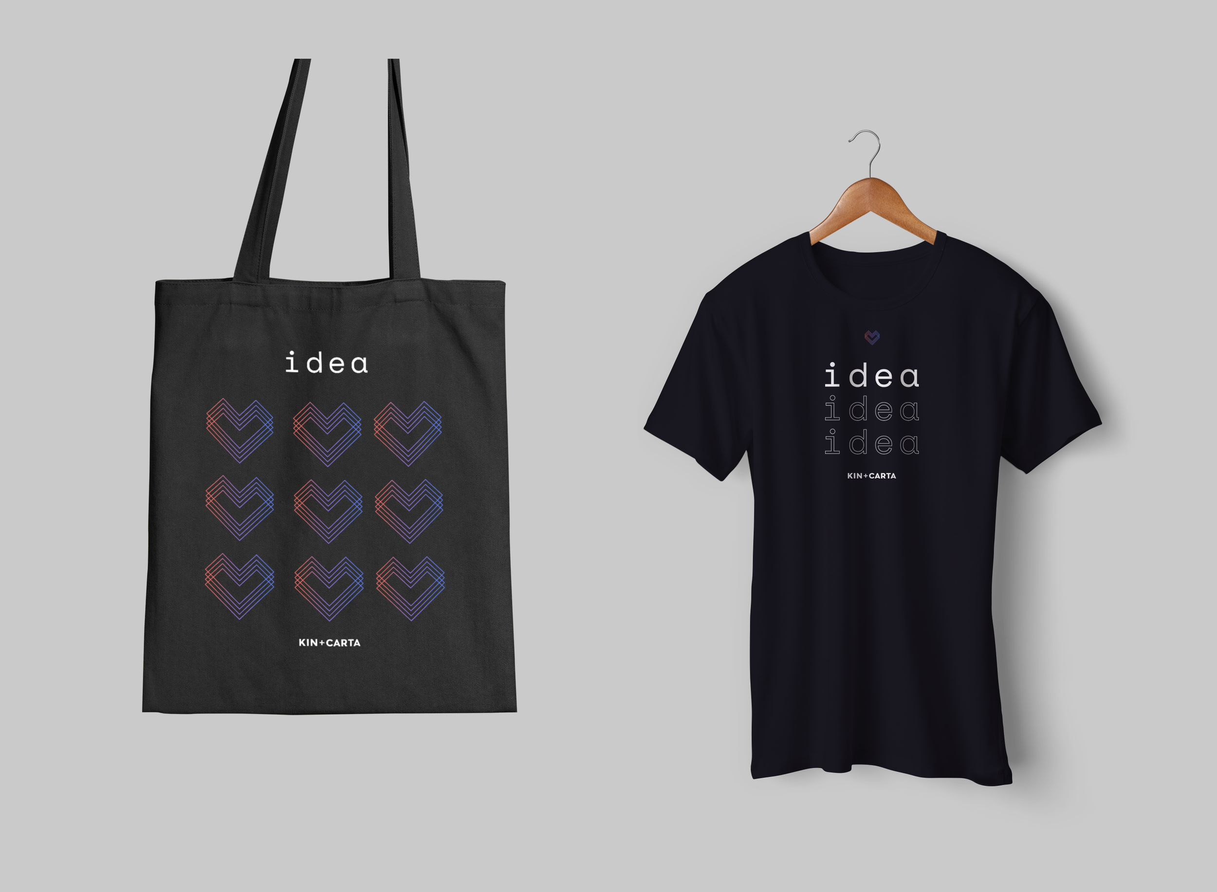
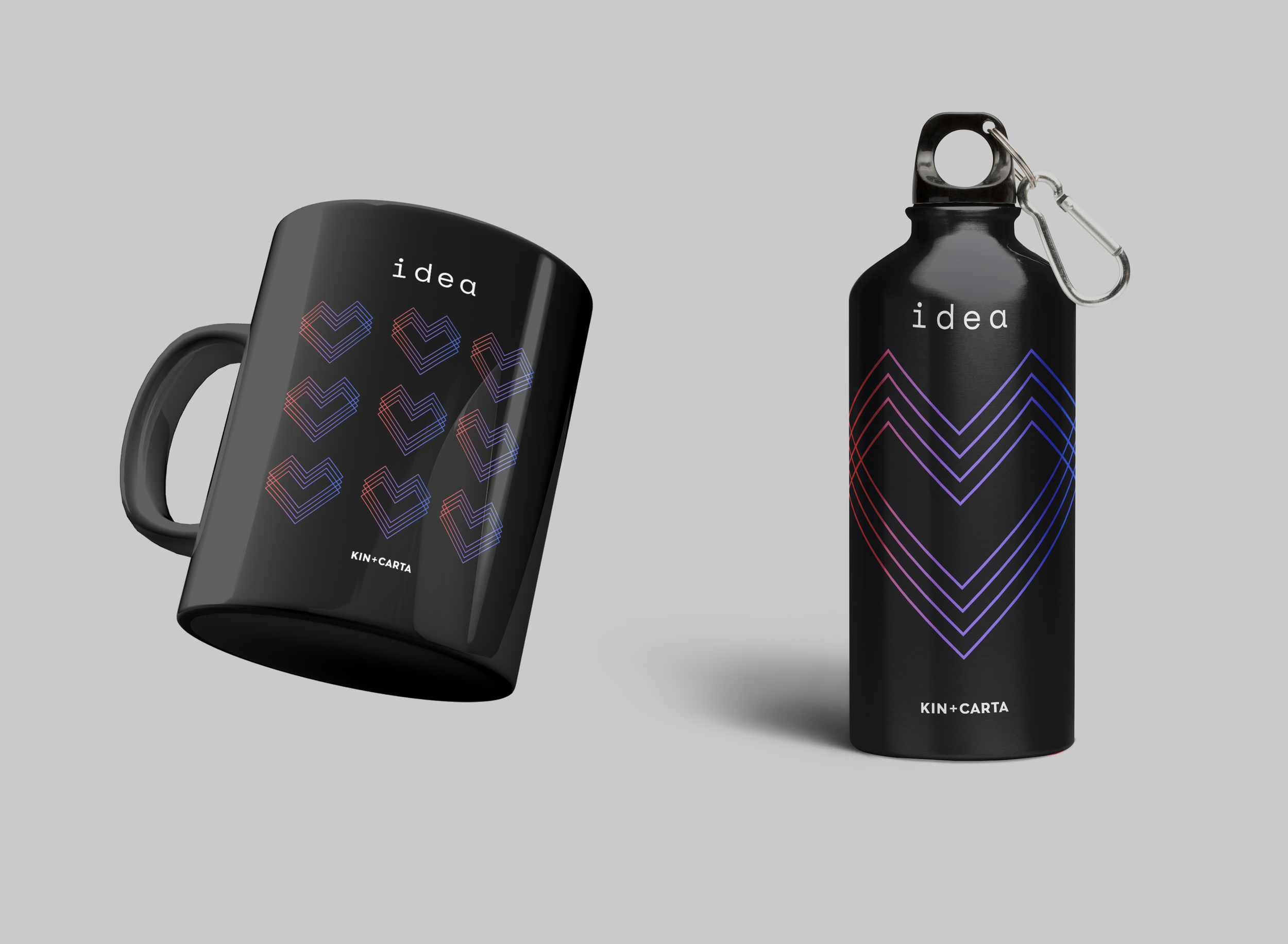
Being an internal brand, it was a great opportunity to create fun extras such as stickers, badges and swag items.


